One of our more frequently asked questions is “what constitutes ‘high-res’ or ‘low-res’ images?” True, we designers are always asking for high-res or EPS files, but what does that actually mean? And how do you know if the image you’ve got is adequate? It’s an easy question to answer once you have some context surrounding digital images. So get comfy, and we’ll explain!
Vector vs. Raster Images
There are two important means by which digital images might be created and stored. Vector images are based entirely on geometric formulas. Think back to math class, and you might remember that the equation for a circle, for example, is the diameter multiplied by pi. Graphic design programs render vector shapes based on exactly these types of formulas.
Raster images, by contrast, are made up of tiny colored squares (pixels). Like a mosaic, you might view the image from a distance and see only the artwork. But get much closer, and you will eventually see the pattern of squares that make up the image. Below is a circle in a raster format, with a 600% zoom.
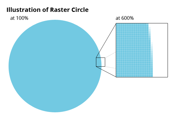
By zooming in, we can see how the raster version is doing its best to approximate a circle using thousands of tiny squares. Each pixel is exactly one unit of color information so those that appear to fade at the edges are actually just a lighter value of the blue color—a compromise between the blue and the white. It’s a way to trick the eye into believing that there’s a curved edge there—and from a distance, it works. In actuality, however, there can never be a true curve in a raster image. (This is why images involving alphabetic shapes can sometimes look fuzzy or distorted on the web.)
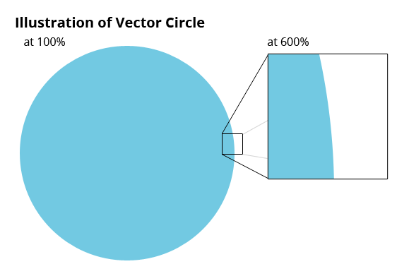
Vector files, on the other hand, never lose quality—regardless of how large they get or how closely you look. Since they’re made from mathematical formulas, they need to be created and rendered using design software, such as Adobe Illustrator. Most often, you’ll see these as .EPS or .AI files. Unfortunately, web browsers don’t interpret these types of images, which is why most of what you’ll see on the web is raster based.
NOTE! Vector images can be turned into raster images, but once they become pixel-based they can never go back.
The Building Blocks of Resolution
So if we’re talking resolution, or about any image used on the web, it’s safe to say we’re talking about raster images. (File types include .JPGs, .GIFs, .TIFs, .PNGs, etc.) These will vary in quality, based the density of pixels in the image. Resolution—measured in pixels per inch (ppi)—is the term used to represent this density.
Two common resolutions you’ll hear are 72 ppi and 300 ppi. 72 ppi is considered “low-res” and 300 ppi is considered the minimum for “high-res.” A high-res image packs in thousands of pixels—each one a distinct unit of color information. A low-res image has much less density; so when it’s enlarged to be bigger on screen (or in print), your display or printer has to guess at most of that information, filling in the gaps with what it assumes are the right colors. The result is a blurry image with little detail.
Castro, our Director of Office Security
So How Do I Make My Images High-res?
Because of the slowness of early modems, the web was designed around low-res (72 ppi) images.* To accommodate, digital cameras also shoot images at 72 ppi. However, most printing is done at 300 dots per inch (dpi)—which is the printed-output translation of ppi. Thus, images designed for the web also tend to look pixelated or blurry when printed.
(*Note that the old standard of 72 ppi images for the web is changing with the advent of retina displays. We explain that in our article, Retina Displays: What They Are and Why They Matter to Anyone with a Web Site.)
Digital cameras describe images in terms of total pixels. So for example, you may see an image shown as 1290 x 960. (The first number is the width; the second is the height.) How large is this image? Well, it depends on whether you’ll be viewing it on screen or in print. By default, the image is likely at 72 ppi. So on a screen—which prefers its images at 72 ppi—this translates to a whopping 18″ x 13″! But… if you also want to print the image at reasonable quality, you’ll have to shrink the size down so that the effective ppi has increased to at least 300. Since 72 ppi is roughly 24% of 300 ppi, you’ll need to decrease the dimensions of your image to 24% of its original size. That same 1290 x 960 image, now at 300 ppi and suitable for printing, is only about 4″x3″.
Put simply, if you change the size of your images, the resolution will be affected proportionately. If you’re working in a design program—or even something like Microsoft Word—bear that in mind before you stretch an image to make it bigger or smaller. If you’re starting with an image from the web or a digital camera, you can assume that it’s 72 ppi. Once you start pulling on those little boxes at the edge to make it bigger, expect that the effective ppi (and thus, the quality) is getting worse. If you’re making it smaller, the resolution will be improving.
Photo-editing software can help you scale images to the appropriate size and output type—print or web—so that you’re not scaling them blindly. You can also use the software to change the size of an image while keeping its resolution fixed. (For example, if you want to shrink a large JPG down to a smaller size, but don’t want to increase its resolution above 72 because you’re just using it on the web.) But it’s important to note that while you can always go down in resolution/quality, you can never go up without making the image smaller.
How Do I Know the Resolution of an Image?
Without photo-editing software (or having shot the photo yourself), the easiest way to estimate the resolution of an image is to look at its file size. A 4″x3″ image at 300 ppi is roughly around 3MB (megabytes). The same 4″x3″ photo at 72 ppi is much smaller at about 182K (kilobytes). It’s safe to say that most photographs under 1MB are ill-suited for printing, unless they are to be used at a very small size. Certain file types (especially .GIFs) are also usually unsuitable for printing. They’re designed to be as small as possible for quick screen loading—typically with a major degradation in quality.
Practical Applications for Nonprofits
Chances are, your organization is shooting photos at events and in the field—possibly from a variety of cameras. Although you may have the immediate intention of posting images just to your blog or Facebook page, it may still be wise to shoot at the highest quality (though it will fill up your storage card faster). By shooting at high quality, you can then make a low-res copy for your Twitter page, while hanging onto the high-res original for next year’s annual report.
Lastly, we’ll swing back around to the topic of vector images. If your organization has vector versions of anything, keep them safe! Sure, they’re useless on the web, but designers should always start from a copy of the vector version and rasterize it to suit your digital applications. This ensures that we’re starting with the best possible quality (not to mention your original color intentions). Just a reminder: a vector image can be rasterized—and automatically will be when opened in most photo-editing programs. But once saved, a raster image can never be made vector again. Therefore, it’s always important to leave the original untouched, and work from copies!
As always, we welcome the opportunity to clear up some of the mystery surrounding design and digital images. Feel free to leave a comment below, or contact us with questions!
17 Comments on "Image Resolution Tips for Non-designers: High-res, Low-res and Everything Else You Need to Know"
Swarna
December 22, 2015is file with small size like 123 kb but resolution 300 pixel considered high resolution file?
Or size of the file should be large. what should be the minimum size and resolution for high resolution file for print purpose.
Kristen Argenio
December 22, 2015Unfortunately, it's tricky. It depends on the size you'd like it to be on the page. If a file is only 123 kb with a 300 pixel ppi, it's going to be very, very tiny.
For print purposes, you want a minimum resolution of 300ppi at whatever size (dimensions) you plan to use it on the page. So that depends on your design, and how you intend to use the image. My guess is the file with 123 kb is going to be too small to be very useful.
Hope this helps!
Terry
January 22, 2016Please note that your link to the Retina displays page doesn't work. The .com has 2013 appended to it. Taking that off makes it work.
https://idealdesignco.com2013/04/30/retina-displays-what-they-are-and-why-they-matter-to-anyone-with-a-web-site/
Kristen Argenio
January 22, 2016Fixed, thank you!
Fritz
February 29, 2016Unfortunately, some of this info here is incorrect. While it's true that 72dpi is screen resolution, and 300 dpi is print resolution, the ultimate point is: how many pixels does the file have? A 3000x4000px image is the exact same size, whether it's 72dpi or 300dpi. And a 3000x4000px image will still have the exact same number of pixels, whether it's saved (compressed) as a 300kb file or a 10mb file.
Kristen Argenio
March 1, 2016Thanks for your feedback, Fritz! You're correct: the way I described pixel density was incorrect; I'll think of a better way to phrase it and make an adjustment. Thanks again!
Zyann Alicia Lee
May 10, 2016Hello there, i have a logo (a vector image) that's 74kb, 800 x 800 px. is this considered low-res? it looks fine in it's original size but once i zoom in twice in preview...the edges become jagged.
Kristen Argenio
May 12, 2016Hi there! Yes, I'd say that's too low-res for printing. If it only looks good at original size on a screen, it's going to look even worse when printed. Hope you can find a higher-res version!
James
October 8, 2016Hi, I want to know about high resolution photos vs original photos. What is the difference between them? Does anything change in a photo when you change original to high resolution ( color or size)
Kristen Argenio
October 11, 2016Hi James,
Both terms are used differently, depending on your camera or software. But "original" usually just means the original file straight from the camera, unedited by you. It may or may not be high resolution, depending on your camera settings. Hope this helps!
Will
November 18, 2016Just wanted to note that vector graphics are in fact supported by all major browsers in SVG (Scalable Vector Graphics) format. They can be created in Adobe Illustrator, just like the other vector graphic formats you mentioned in your article.
Source: I am a programmer/web developer
Kristen Argenio
November 21, 2016Hi Will, you're absolutely right! This article was written a while ago and is due for an update. On my to-do list. Thanks for your feedback!